Session dashboard
The Session Dashboard is your central hub for reviewing your performance at a glance. Located on the main Sessions page, this dashboard lists every session you've uploaded and summarizes the most important metrics you need to understand your results. It's the perfect starting point for any review routine, helping you quickly spot which sessions need a closer look.
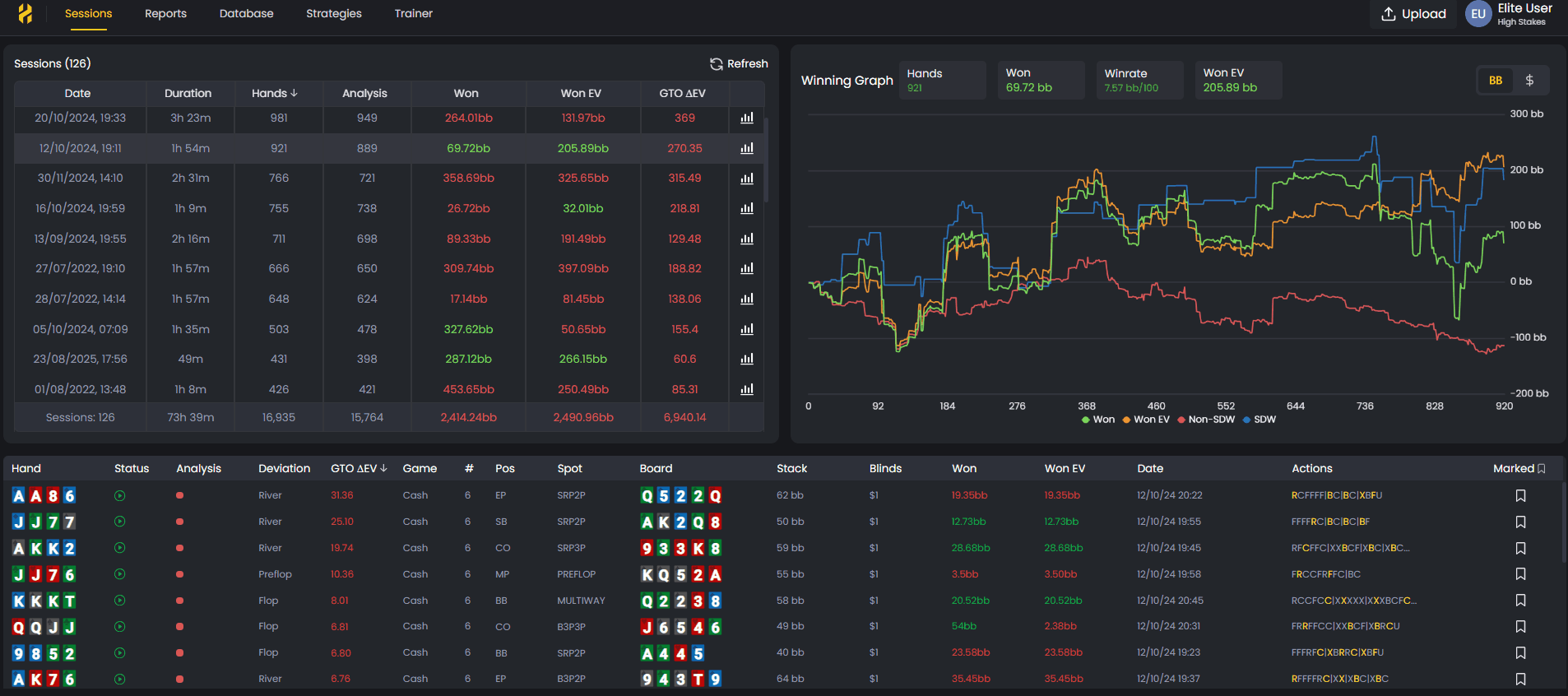
The Session Dashboard gives you a full overview of your performance, including winnings, EV, and GTO accuracy.
When you click on a specific session, FlopHero opens a detailed view with a visual performance graph and a complete hand-by-hand breakdown. Let's explore how to use these powerful tools to guide your GTO study.
Understanding the sessions list
When you land on the Sessions page, you'll see a list of all your uploaded sessions, sorted by date with the most recent one at the top. Each row represents a single session and is packed with crucial data points that tell the story of your performance.
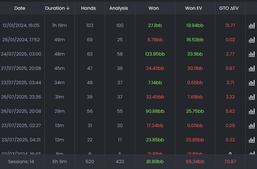
Here are the key metrics you'll find for each session:
- Date: The date and time the session was played.
- Duration: The total time played, shown in hours and minutes.
- Hands: The total number of hands dealt during the session.
- Analysis: The number of hands that were successfully analyzed by our GTO solver.
- Won: Your net winnings for the session, displayed in big blinds (bb).
- Won EV: The all-in adjusted expected value of your winnings, giving you a clearer picture of your performance, independent of short-term luck.
- GTO ΔEV: The total expected value you lost compared to making perfect GTO plays. This is one of the most important metrics for identifying leaks.
At the bottom of the list, you'll find a summary row that totals all of these metrics across all your uploaded sessions, giving you a complete picture of your long-term results.
The Winning Graph
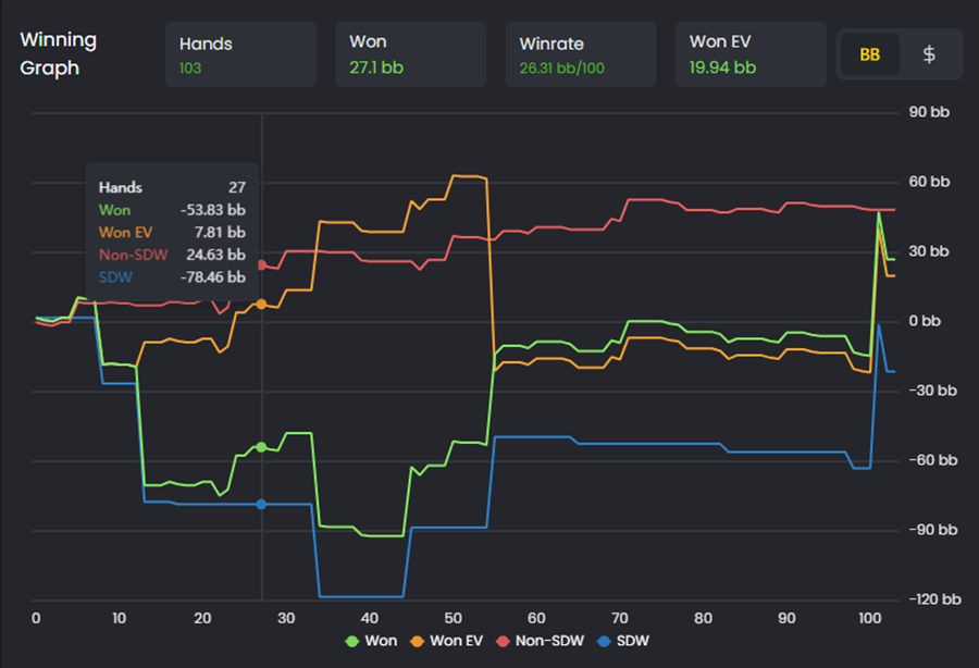
When you click on any session from the list, FlopHero opens a detailed view with the Winning Graph at the top. This graph visualizes your performance throughout the session, plotting four key lines across every hand you played:
- Won (green): Your actual cumulative winnings as the session progressed.
- Won EV (orange): Your expected winnings based on all-in equity, showing what you "should" have won.
- Non-SDW (red): Money won without going to showdown (folds, bluffs that worked).
- SDW (blue): Money won at showdown (when cards were revealed).
Above the graph, you'll see summary statistics for the session: total Hands, Won, Winrate (in bb/100), and Won EV. You can toggle between viewing results in big blinds (BB) or dollars ($) using the buttons in the top right.
This graph is incredibly powerful for spotting variance. When the green line (Won) is far above the orange line (Won EV), you ran hot and got lucky in key spots. When it's far below, you ran cold. The gap between these lines shows you exactly where variance helped or hurt you, helping you separate results from decision quality.
The Handlist breakdown
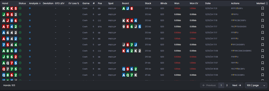
Below the Winning Graph, you'll find the Handlist - a detailed table showing every single hand from your session. This is where you go from high-level overview to granular analysis. Each row represents one hand and includes critical data points:
- Hand: Your hole cards, color-coded by suit.
- Status: Whether the hand was analyzed by the GTO solver.
- Analysis: Icons indicating the quality of your play (optimal, strong, weak, or blunder).
- Deviation: Where your play deviated from GTO recommendations.
- GTO ΔEV: The EV you lost compared to optimal play.
- EV Loss %: Your EV loss as a percentage of the pot.
- Game, Position, Spot: Context about the hand (cash game, your position and type pf spot).
- Board: The community cards (if applicable).
- Stack, Blinds: Your effective stack size and the blind level.
- Won, Won EV: Your actual and expected winnings for that specific hand.
- Date: Timestamp of when the hand was played.
- Actions: The table actions during that play.
- Marked: Mark specific hands for future analysis.
You can sort the Handlist by any column by clicking the column header. This is incredibly useful for finding your biggest mistakes - just sort by GTO ΔEV or EV Loss % to see which hands cost you the most.
For a complete guide to using the Handlist effectively, see Handlist.
Using the sessions dashboard in your study routine
Make the Session Dashboard the first stop in every study session. Start with the sessions list to identify which sessions have the highest GTO ΔEV - these are your priority targets. Then click into those sessions to see the Winning Graph and understand where variance played a role.
Once you've got context from the graph, scroll down to the Handlist and sort by EV Loss % to find your most expensive mistakes. Click on those hands to open them in the GTO Replayer and understand exactly what went wrong.
This workflow: sessions list → winning graph → handlist → replayer—is the most efficient way to turn raw data into actionable improvements. To keep your session data organized, see Database Management. And if you want hands uploaded automatically as you play, check out Live Tracker Setup and Installation.
Was this article helpful?
Still need help?
Join our community
Get instant support from experts and fellow players
Join Discord Community